- Problem
- Every executive hire triggered a 40-page PowerPoint deck that took Onboarding Partners eight hours per profile, half of it waiting on six departments.
- Solution
- A PowerApp portal that cut the manual to seven views and, through Task Management, let Partners delegate each section to the department that owns the data.
- Impact
- Onboarding time cut by 75%, from eight hours to two per profile, with 350+ executives onboarded since the March 2025 launch.
- Role
- Lead Product Designer
- Team
- 1 PO, 1 PowerApp developer, 12 partners, 3 admins
- Timeline
- 9 months, Q3 2024 to Q1 2025
The Problem
Eight hours per executive profile, and half of it was chasing people
Every executive hire triggered a 40-page PowerPoint deck. Onboarding Partners coordinated handoffs across six departments, copied data by hand from systems that did not talk to each other, and assembled the final PDF themselves. Half of the work was not creation at all. It was waiting on other people.
Fifteen stakeholder interviews surfaced the same four frictions. Ranked by how often each occurred and how badly it slowed the work, the top two accounted for roughly 80% of the time lost.
- High impact · High frequency Coordination overhead Four hours of every profile spent waiting on six departments.
- High impact · High frequency Manual entry Data copied by hand between systems that never shared a record.
- High impact · Lower frequency No automation Every profile started again from a blank 40-page template.
- Lower impact · Lower frequency Version control Which deck was current? Nobody could say for certain.
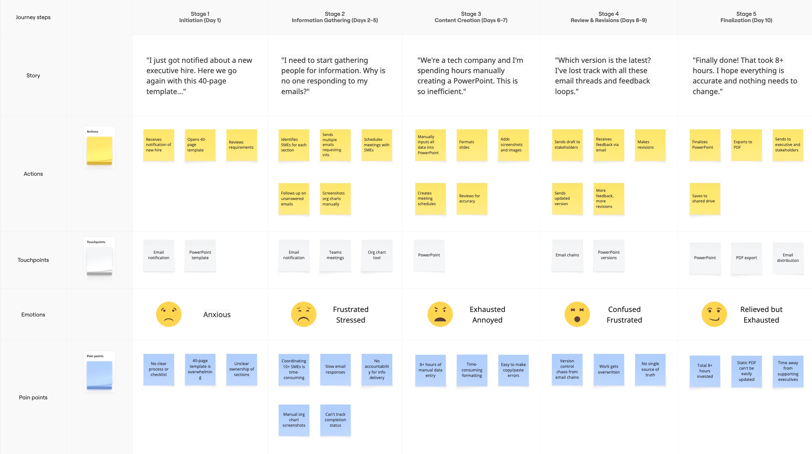
To make the cost visible to stakeholders, I mapped one full profile build end to end: five stages across ten working days, from "Here we go again with this 40-page template" to "Finally done! That took 8+ hours." The emotional arc did more to win support than any of the numbers.
The Pivot
Halfway through, the people I had designed for were laid off
I had spent three months building the right tool for the wrong users. During user acceptance testing the Onboarding Partners said: "I don't have information for these sections. Let me skip and come back." That one sentence exposed the assumption hidden inside the brief.
Two choices: pause the project to find replacement users, or redesign for the people who remained. The Partners were staying, but they were never going to do the data entry. Whatever shipped had to let them delegate, not execute.
The Fix
40 pages became 7 views, and data entry became delegation
An audit of the manual was liberating: 82.5% of it was boilerplate that never changed between executives. Thirty-three pages became SharePoint templates. The seven that did change became the PowerApp, with contact information, org chart, team responsibilities and key stakeholders each collapsing from several pages into one view.
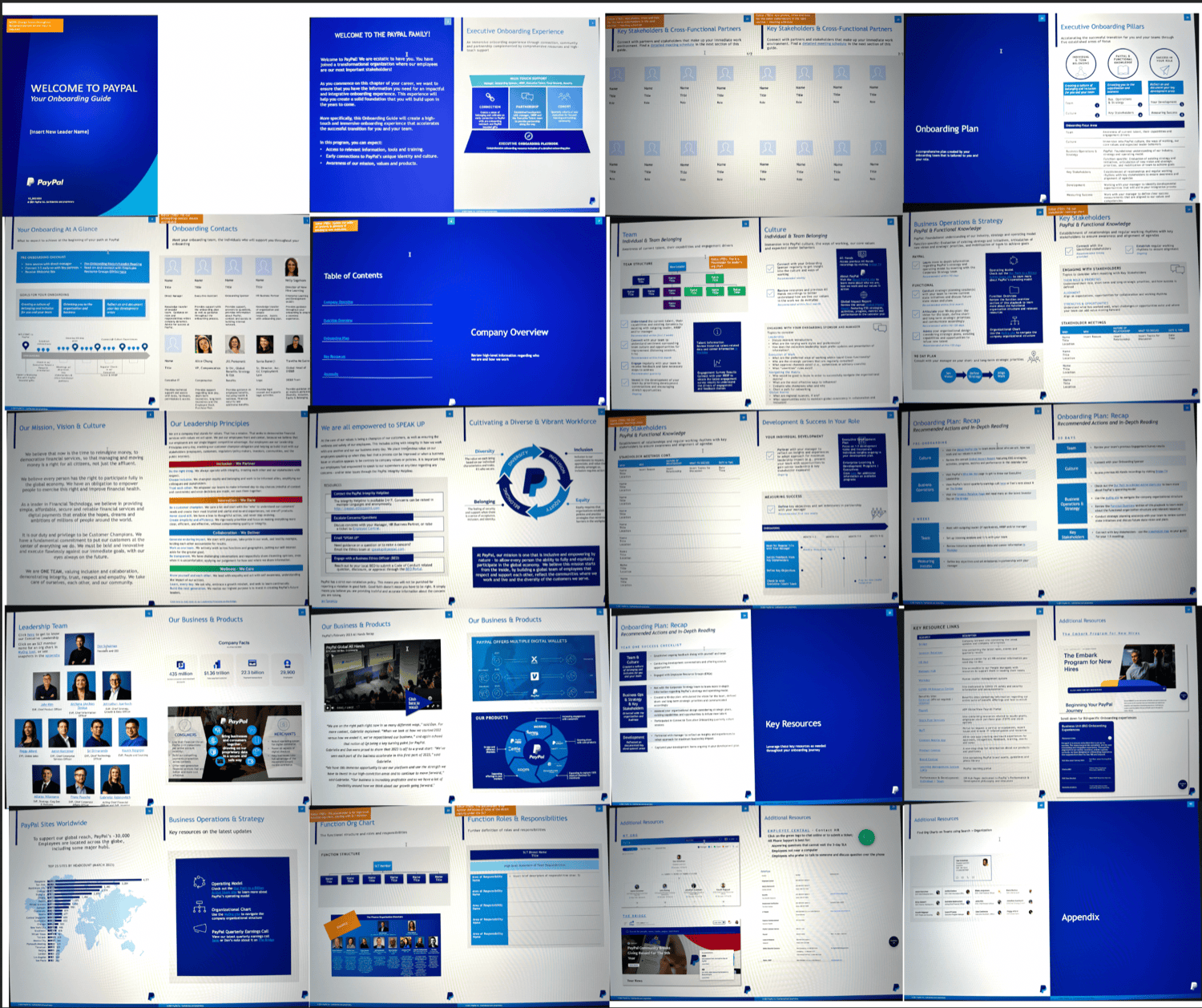
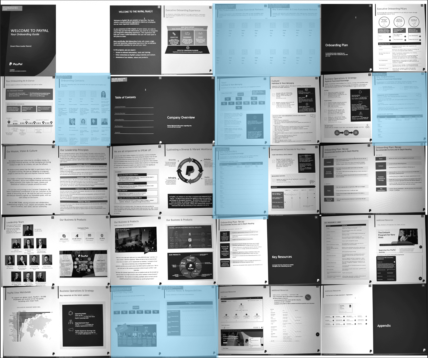
Only seven pages held content that changed between executives. The other 33 were boilerplate to template, not build.
Task Management
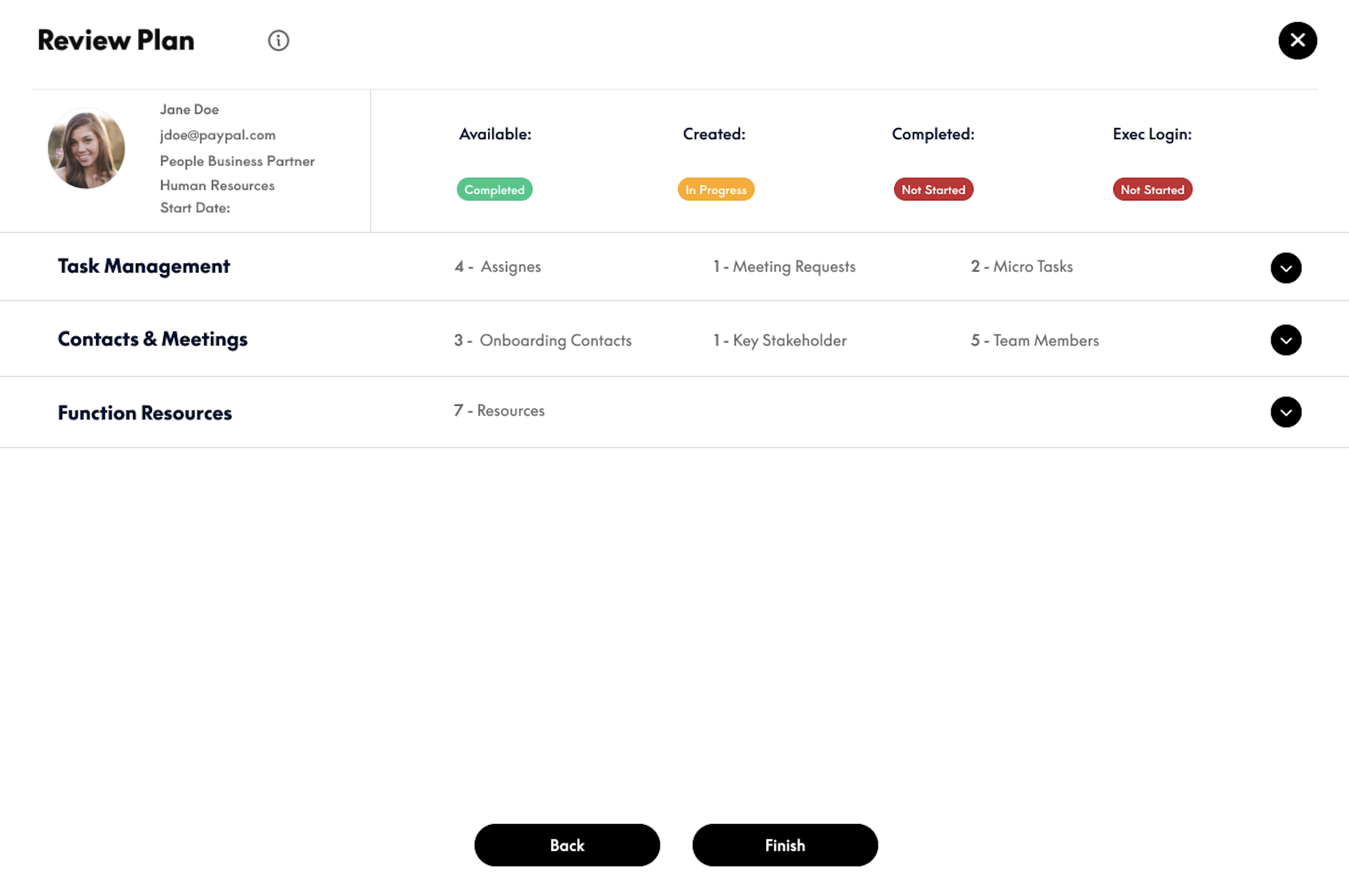
If the remaining users were coordinators, the tool had to let them assign. Task Management lets a Partner hand each section of the profile to the department that owns the data (HR for the org chart, IT for systems access, Finance for budget) and see at a glance who has finished what. Profile assembly became a side effect of normal departmental work, not extra labor.
Version 1 to version 2
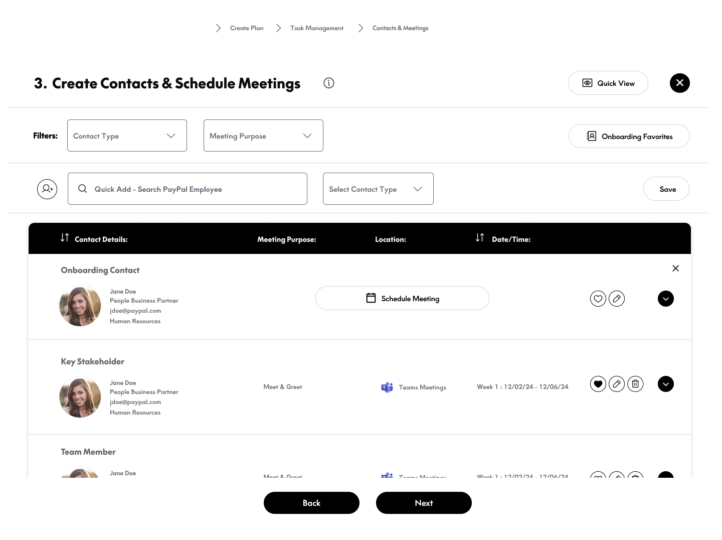
Version 1 was a wizard: one operator, a fixed sequence, and hard dependencies between steps. Version 2 made delegation the organizing principle, the same work restructured around who actually does it.
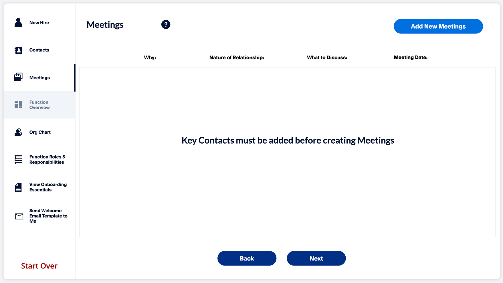
"Key Contacts must be added before creating Meetings." The blocking dependency assumed one person had all the information and would enter it in order. Nobody did.
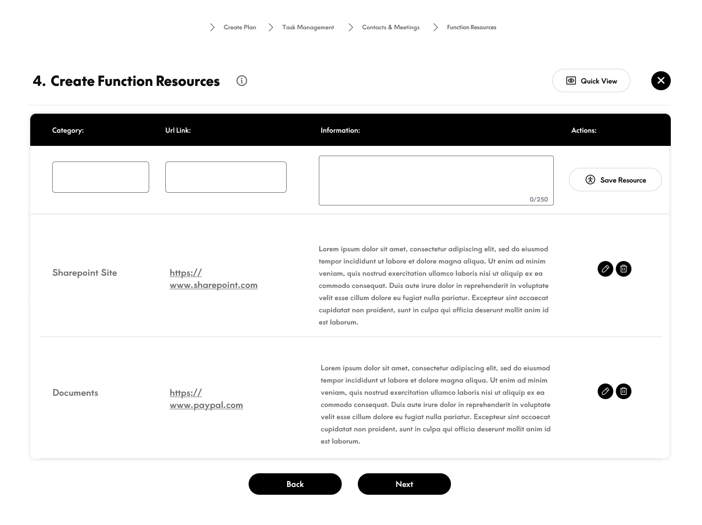
The same contacts-and-meetings work, now one stage in a flow that runs through Task Management, each section fillable by the department that owns the data.
What the coordinator sees
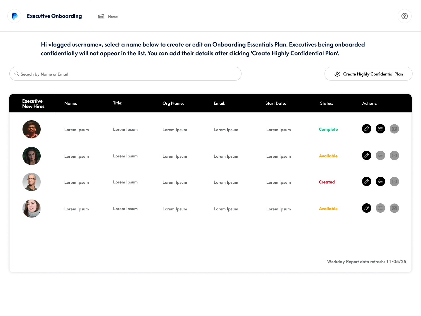
Every screen in the shipped portal answers one question: where does this profile stand, and who is holding it up? The roster shows every executive in flight with a live status. The review screen breaks one profile down by section, owner and state, so a Partner's job becomes confirming work, not assembling it.
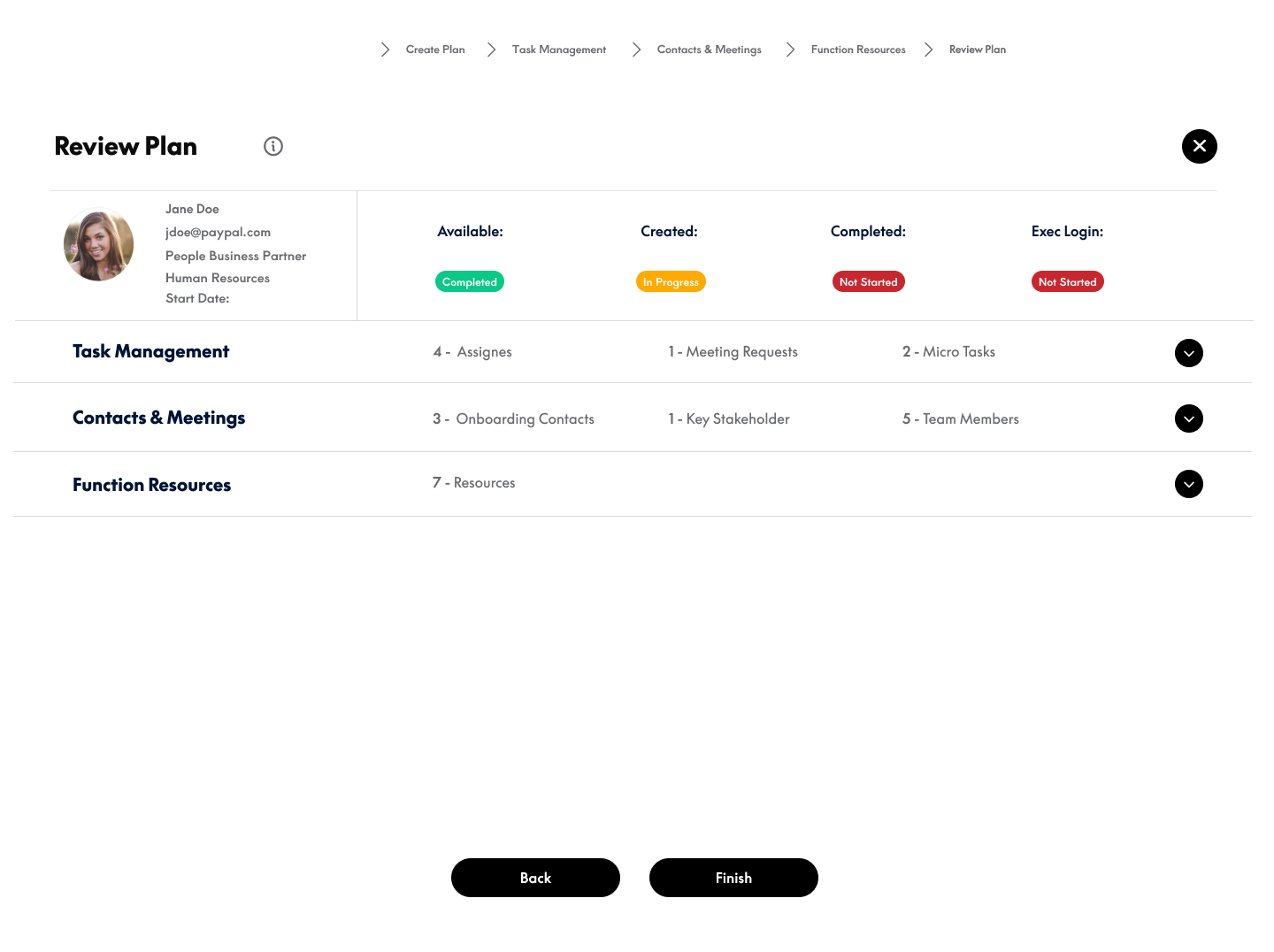
The 33 boilerplate pages live on as SharePoint templates linked into each plan, maintained once rather than once per executive.
Outcome
Live in March 2025, and 350 profiles later the team has not grown
The portal went live ahead of the new fiscal year. Within nine months it had processed 350+ executive profiles, and the team that runs it has never asked for another hire.
The coordinator who used to chase
“This completely changed how we work. I can actually see what’s happening instead of chasing people down via email.”Onboarding Partner
The skeptic the redesign had to win over
“I was skeptical at first, but the task management feature makes my life so much easier. I know exactly what I need to do and when.”IT Administrator
What I took from it
The best design isn't the most elegant. It's the one that actually gets used.
Organizational politics turned out to be real design constraints. Power dynamics, process ownership and resistance to change mattered as much as user needs. We designed for the wrong users, found out right before launch, faced layoffs, and still shipped a solution that processed 350+ executives in its first year.
Task Management, the feature that defines the portal, only exists because users refused to take ownership. The most valuable design moves came from working with resistance, not against it.